Introduction
A large wall to decorate is one of the most influential yet cognitively challenging elements in interior architecture. Across modern European homes—whether it is a minimalist apartment in Frankfurt, a Paris-inspired salon, or a Scandinavian-style residence in Copenhagen—expansive blank walls frequently create a similar perceptual issue: the room feels incomplete, visually unstable, or emotionally “unfinished.”
From an NLP (Neuro-Linguistic Programming) design perspective, this reaction is not random. The human brain naturally seeks pattern recognition, visual anchoring, and spatial coherence. When a wall lacks structure, the mind interprets it as “missing information.”
The core misunderstanding most homeowners face is not a lack of decorative inspiration, but a lack of cognitive design structure. People often attempt to “fill space” instead of constructing visual meaning.
In professional European interior design systems (especially trending in 2026), large walls are not treated as empty surfaces. Instead, they are treated as architectural communication fields—where proportion, rhythm, hierarchy, and emotional tone must be deliberately engineered.
Rather than random decoration, designers apply structured systems rooted in:
- Visual psychology
- Spatial hierarchy
- Scale calibration
- Material linguistics
- Emotional design mapping
This guide breaks down how to properly design a large wall to decorate using advanced interior frameworks that combine aesthetics with cognitive science.
You will learn:
- Why large walls feel visually “empty”
- How scale psychology governs perception
- Proven European design systems
- Step-by-step wall composition methodology
- Room-specific application strategies
- Advanced architectural styling systems
- Common design failures to avoid
- 2026 European interior trends
This is not superficial decoration advice—it is a structured interior design cognition model for building visually intelligent spaces.
Why a Large Wall to Decorate Feels Difficult
From a perceptual psychology standpoint, large walls create a condition known as visual under-stimulation. This occurs when the brain receives insufficient spatial cues to interpret balance.
The 3 Core Cognitive Problems
1. Absence of Focal Anchoring
Without a dominant visual anchor, the wall becomes cognitively “unregistered.” The brain cannot assign importance or hierarchy.
2. Scale Misalignment (Most Common Error)
When small decorative elements are placed on a large wall, perceptual distortion occurs. The wall appears even larger, amplifying emptiness rather than reducing it.
3. Structural Randomization
Random placement leads to visual entropy—a lack of order that disrupts emotional comfort and spatial readability.
What Happens in Human Visual Processing
When observing a poorly designed large wall to decorate, the brain experiences:
- Cognitive void perception
- Loss of spatial reference points
- Emotional detachment from environment
- Reduced visual engagement
This is why professional designers rely on structured systems rather than intuitive placement.
Scale Psychology & Visual Weight
Scale is the most dominant factor in large wall composition.
Visual Weight Definition (NLP Design Lens)
Visual weight refers to the perceived “heaviness” of an object within a visual field. It is influenced by:
- Dimensional size
- Color intensity
- Contrast ratio
- Material density
- Positional dominance
A large wall requires high visual weight elements to stabilize perception.
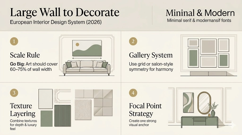
The 2/3 Rule
A widely used proportional guideline:
Wall décor should span approximately two-thirds of adjacent furniture width
Example:
If a sofa is 240 cm wide, the artwork should be around 160 cm.
This ensures:
- Spatial equilibrium
- Visual anchoring
- Professional-grade composition
Wall Coverage Logic
Ideal wall coverage ratio:
0.6≤Wall Coverage Ratio≤0.750.6 \leq \text{Wall Coverage Ratio} \leq 0.750.6≤Wall Coverage Ratio≤0.75
Interpretation:
- Below 60% → wall feels empty
- Above 75% → wall feels overcrowded
- Optimal range → balanced luxury perception
Importance of Correct Scaling
When scale is misaligned:
- Even premium artwork appears insignificant
- Furniture disconnects visually
- Room loses architectural coherence
When scale is correct:
- Entire environment feels intentionally designed
- Space appears premium and curated
- Wall becomes the dominant focal system
Professional Design Systems for a Large Wall to Decorate
Instead of random decoration, European designers use structured composition systems.
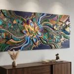
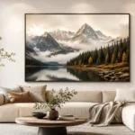
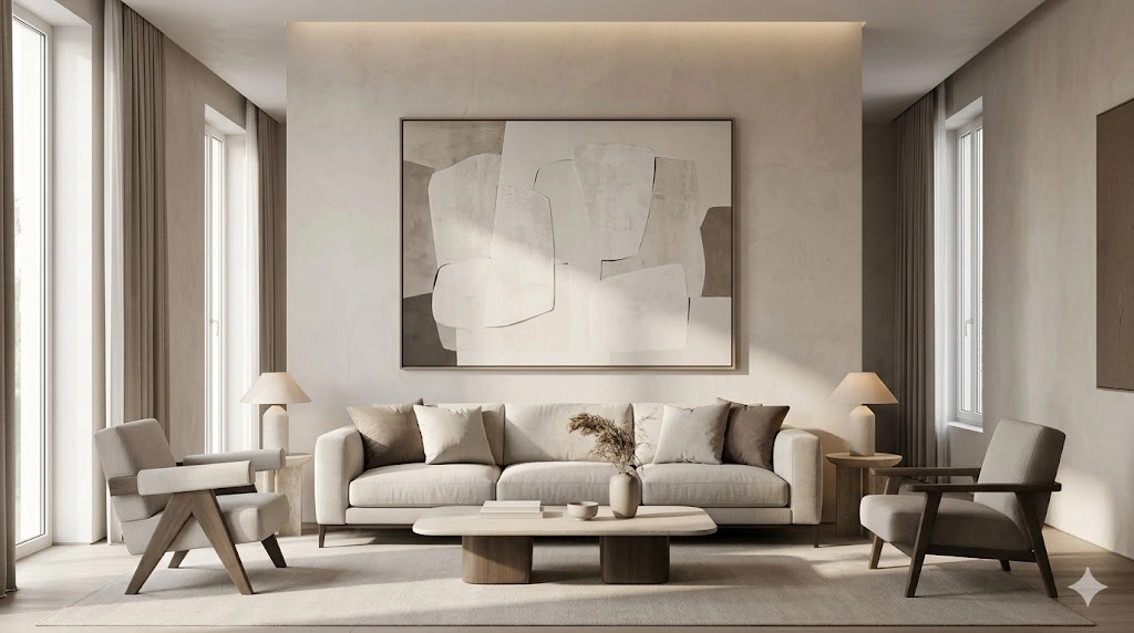
Statement Anchor System
This system uses a single dominant visual element.
Examples:
- Oversized abstract artwork
- Large framed mirror
- Sculptural wall installation
NLP Effect:
- Cognitive clarity
- Strong focal anchoring
- Perceived luxury increase
Best for:
- Scandinavian interiors
- Modern minimalist homes
- High-end apartments
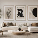
Gallery Composition System
This system uses multiple framed elements arranged strategically.
Layout Types:
- Grid symmetry layout
- Organic salon arrangement
- Horizontal linear alignment
NLP Effect:
- Emotional storytelling
- Memory association
- Personalized environment building
Best for:
- Family homes
- Creative interiors
- Warm European apartments
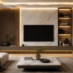
Architectural Integration System
This is the highest-level design methodology.
Includes:
- Wall panel architecture
- Wood slat structures
- Integrated LED lighting
- Floating shelving systems
NLP Effect:
- Permanent structural identity
- High perceived value
- Architectural immersion
Best for:
- Luxury villas
- High-end penthouses
- Modern European residences
Step-by-Step System: How to Decorate a Large Wall to Decorate
1: Define Wall Function
Identify purpose:
- Is it a focal wall?
- Is it a secondary background structure?
- Is it transitional (hallway)?
Function determines design language.
2: Establish Visual Zones
Divide the wall into:
- Cognitive eye-level zone
- Structural alignment zone
- Negative buffer space
This ensures a balanced visual hierarchy.
3: Select One System Only
Never combine multiple systems.
Choose:
✔ Statement system
✔ Gallery system
✔ Architectural system
Consistency creates cognitive clarity.
4: Apply Correct Scale Logic
Rule:
Large wall = large elements only
Avoid:
- Small frames
- Fragmented décor
- Low visual density objects
5: Balance Composition
Ensure:
- Equal spatial spacing
- Horizontal alignment consistency
- Defined focal point
Symmetry = calm perception
Asymmetry = modern dynamic energy
6: Add Depth Layers
Depth is achieved through:
- Material contrast
- Light layering
- Shadow variation
- Textural differentiation
This transforms decoration into architectural experience.
Comparative Strategy Matrix
| Strategy Type | Best Use Case | Style Identity | Complexity | Visual Impact |
| Statement System | Minimal interiors | Clean luxury | Easy | High |
| Gallery System | Family homes | Emotional | Medium | Medium-High |
| Architectural System | Luxury homes | Structural | Advanced | Very High |
Room-Based Application Guide
Living Room
Recommended:
- Oversized centerpiece art
- Horizontal gallery system
- Large reflective mirror
Focus: Social energy + visual dominance
Bedroom
Recommended:
- Soft abstract compositions
- Symmetrical paired frames
- Neutral tonal palette
Focus: Calmness + emotional relaxation
Hallway
Recommended:
- Vertical rhythm gallery
- Linear frame sequencing
- Slim architectural shelves
Focus: Movement flow + transition energy
Dining Area
Recommended:
- Statement luxury artwork
- Elegant reflective mirror
- Warm tonal compositions
Focus: Hospitality + atmospheric richness
2026 European Interior Design Trends
Modern design in Europe emphasizes:
Key Directions:
- Oversized abstract compositions
- Neutral tonal ecosystems
- Textured plaster surfaces
- Grid-based structural layouts
- Integrated lighting architecture
Influences:
- Scandinavian functional minimalism
- French aesthetic luxury
- Italian architectural heritage
- German precision design logic
Common Mistakes
Avoid:
- Using small art on large walls
- Ignoring proportional scaling
- Overcrowding surfaces
- Lack of focal hierarchy
- Random decorative placement
These errors reduce perceived interior value.
Pros & Cons of Each Method
Statement System
Pros:
- Clean visual identity
- Easy execution
- Strong luxury perception
Cons:
- Limited flexibility
- Requires strong artwork selection
Gallery System
Pros:
- Highly customizable
- Emotional storytelling
- Flexible structure
Cons:
- Can appear cluttered
- Requires planning discipline
Architectural System
Pros:
- Ultra-premium appearance
- Long-term structural value
- High design impact
Cons:
- Higher cost
- Requires professional planning
FAQs
The most effective method is to use structured design systems such as statement artwork, gallery compositions, or architectural wall integration rather than random decoration placement.
For optimal visual balance, wall art should occupy approximately 60%–75% of the focal wall area depending on furniture scale and room proportion.
Use high-visual-weight elements such as oversized art pieces, large mirrors, or layered textured materials to restore spatial balance and visual anchoring.
No. Negative space is a critical element of modern European design. Proper spacing enhances luxury perception and prevents visual overload.
Current trends include oversized abstract art, structured grid layouts, natural textures, architectural wall panels, and integrated lighting systems.
Conclusion
A large wall to decorate is not an aesthetic problem—it is a strategic design opportunity.
From a modern European and cognitive design perspective, successful wall styling depends on:
- Scale intelligence
- Structured composition systems
- Visual hierarchy control
- Emotional spatial design
In 2026 interior design thinking, the most powerful spaces are not those filled with objects—but those that are intentionally structured, balanced, and meaningful.
A well-designed wall does more than enhance décor—it defines the psychological identity of the entire room.